Published: 27th February 2025

First impressions count. Whether it’s a website, a presentation, or an internal campaign, the way something looks has a huge impact on how people engage with it. But what does ‘great design’ actually mean and why is it so essential?
The power of first impressions
When it comes to making an impact, design plays a crucial role. As Rob, our Creative Lead, put it:
People make an impression of you or your organisation within the first few seconds of interacting with you.
That impression isn’t just about looking ‘nice’, it’s about clarity, credibility and engagement. Good design makes information easier to digest, helping people quickly understand what they need to know. Whether it’s a digital transformation programme or an internal training initiative, well-crafted visuals help cut through the noise and capture attention.
Design that cuts through the noise
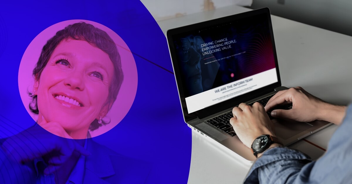
A common challenge in organisations is information overload. Employees receive countless emails, documents and notifications, so how do you make yours stand out?
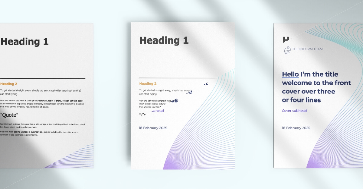
Take our work with Lewisham Council, for example. They wanted to drive engagement with their digital upskilling programme but were struggling to get people’s attention. Initially, course details were shared as plain Word documents, functional, but forgettable. By introducing a consistent, engaging visual identity, we transformed these into eye-catching, easy-to-navigate materials that helped employees immediately recognise and engage with the training. Rob pointed out:
If you’re just given a plain Word document, are you really going to be excited about the course?
The answer? Probably not.
The impact of design extends beyond documents. When branding and design principles are applied across emails, PowerPoint slides and training materials, employees can easily recognise content from a particular programme, making it more likely they’ll engage with it.
User experience: Design for the journey
Good design isn’t just about aesthetics, it’s about function. A well-designed campaign doesn’t just look great; it guides the user seamlessly from awareness to action.
For example, in a change programme, the goal might be to encourage employees to sign up for training. A well-structured email campaign with strong branding, clear messaging and an obvious call-to-action makes that process intuitive. Each touchpoint, whether an email, PDF, or slide deck needs to reinforce the message and make it as easy as possible for the user to take the next step. Rob stated:
People shouldn’t have to use too much brainpower just to understand what you’re asking them to do.
The art of managing stakeholders through design
Switching between different brands and guidelines is a skill in itself. Our creative studio works with multiple organisations, each with its own look, feel and expectations.
“At any one time, I’m working on about seven different brands,” Rob shared. Some clients have strict brand guidelines, while others don’t have any at all, meaning our team often plays a consultative role, shaping a visual identity from scratch.
One of the biggest challenges? Stakeholder expectations.
Sometimes, a client will have an idea in their head of what they want but no clear way of expressing it.
This is where relationship-building and iterative design come in, working closely with stakeholders to align on a vision and refine designs until they land just right.
Measuring the success of design
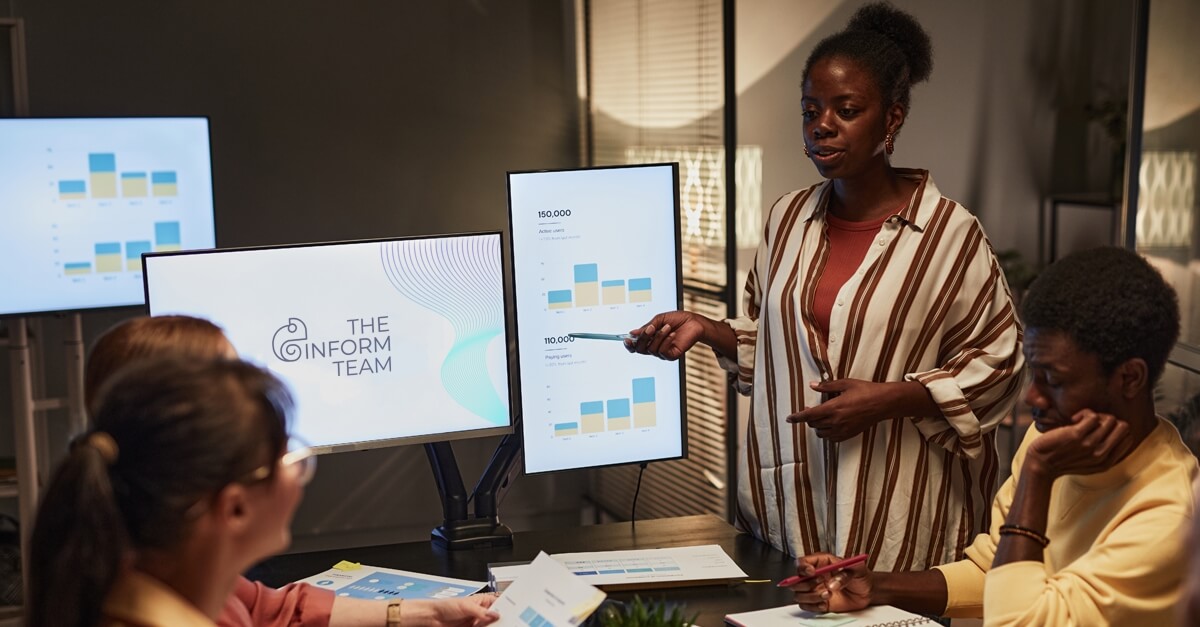
One of the trickiest things about design is proving its impact. Unlike marketing campaigns, where success can be measured in clicks and conversions, design success is often felt rather than tracked.
That said, there are ways to measure effectiveness:
Hard metrics

Website analytics, email click-through rates and engagement on branded materials.
User feedback
Pulse surveys and stakeholder input to gauge reactions.
Internal adoption
Are people using the materials? Do they help simplify workflows?
“For me, success is when design helps achieve the intended goal – whether that’s increased sign-ups, smoother internal processes, or just making information clearer for the user,” Rob explained.
AI and the future of design

With AI tools like Microsoft Copilot becoming more advanced, where does that leave human designers? While AI can speed up certain tasks, like generating templates or colour schemes, it still lacks the intuition, creativity and understanding of nuance that a professional designer brings.
Clients might use AI to generate a deck, but then they realise it doesn’t quite work.
Great design isn’t just about following rules, it’s about knowing when to break them to create something truly impactful. That said, AI does have its place. Our team already uses it for things like mood boards and accessibility checks, helping to streamline our workflows while keeping the creative process at the heart of what we do.
Final thoughts
Design that works for you
Design isn’t just a ‘nice to have’, it’s a business-critical function that enhances communication, drives engagement and brings clarity in an increasingly noisy world.
If you’re looking to elevate your design approach, whether for a change programme, training initiative, or internal campaign, our team is here to help. Let’s chat about how we can bring your vision to life because great design doesn’t just look good. It works.


